Modern businesses generate and consume increasingly large amounts of data. Information is needed to support operational and strategic decisions. Despite the advent of Big Data tools and technology, most organizations I have worked with aren’t able to take advantage of the data or tools in their daily work. While greater awareness of human visual perception and cognition has improved dashboard designs, effective decision-making is often limited by the type of information monitored.
It is common to see summary statistics (such as sum, average, median, and standard deviation) being used in reports and dashboards. In addition, various metrics are used as Key Performance Indicators (KPIs). For example, in manufacturing, management often use Overall Equipment Effectiveness (OEE) to gauge efficiency. In quality, process capability indices (e.g. Cpk) are used to evaluate the process’s ability meet customer requirements. In marketing, the Net Promoter Score (NPS) helps assess customer satisfaction.
All of these are statistics, which are simply functions of data. But what does each of them tell us? What do we want to know from the data? What specific information is needed for the decision?
Unfortunately, these basic questions are not understood by most people who use performance metrics or statistics. I discussed some specific mistakes in using process capability indices last July. A more general problem is that statistics can hide the information we need to know.
For example, last year I was coaching a Six Sigma Green Belt (GB) working in Quality. A manufacturing process had a worsening Cpk. The project was to increase the Cpk to meet the customer’s demanding requirement. Each time we met, the GB would show me how the Cpk had changed. But Cpk is a function of both the process center (average) and the process variation (standard deviation), which comes from a number of sources (shifts, parts, measurements, etc.). The root causes of the Cpk change were not uncovered until we looked deeper into the respective changes in the average and in the different contributors to the standard deviation.
The key takeaway is that when multiple contributors influence a metric, we cannot just monitor the change in the metric alone. We must go deeper and seek other information needed for our decisions.
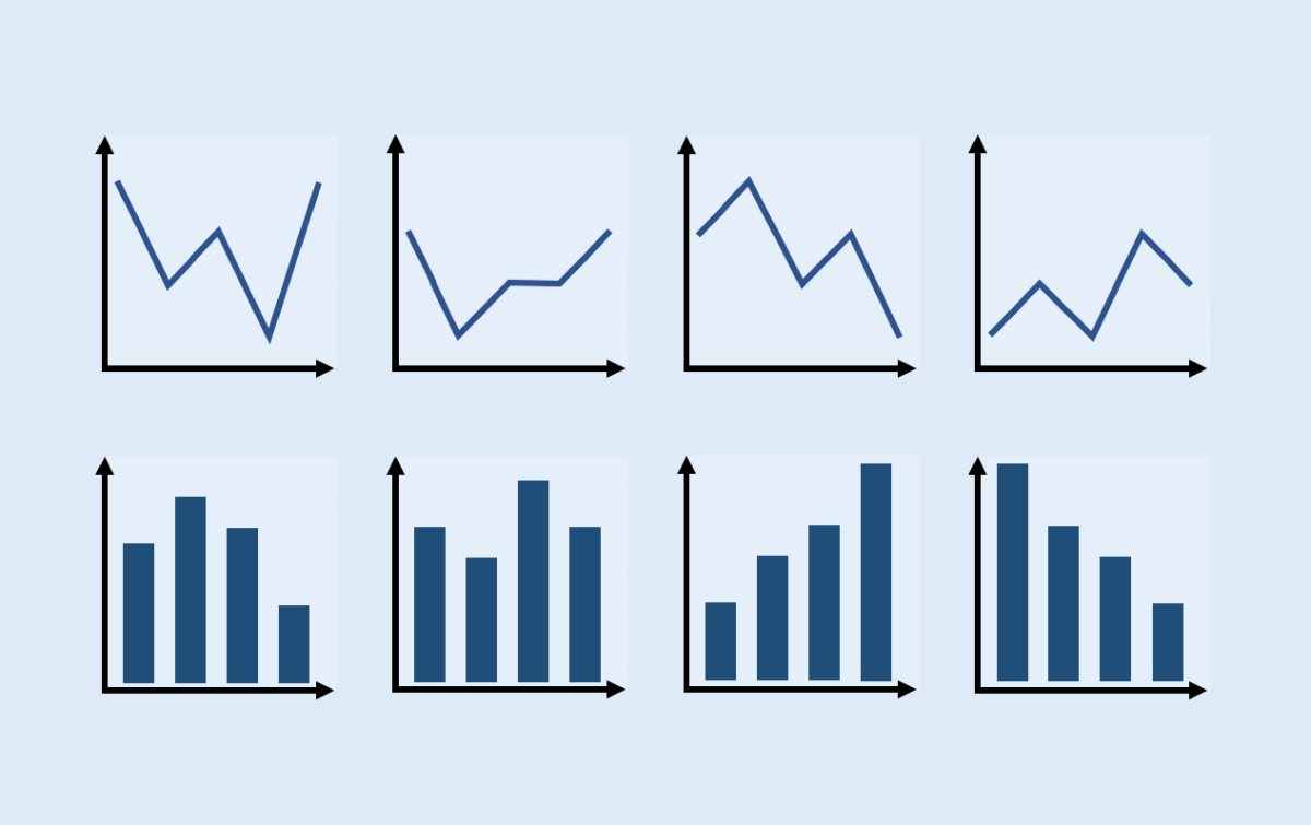
Many people may recall in statistics training that the teachers always tell them “plot the data!” It is important to visualize the original data instead of relying on statistics alone because statistics don’t tell you the whole story. The famous example to illustrate this point is the Anscombe’s quartet, which includes four sets of data (x, y) with nearly identical descriptive statistics (mean, variance, and correlation) and even the same linear regression fit and R2. However, when visualized in a scatter plot, they look drastically different. If we only looked at one or few statistics, we would have missed the differences. Again, statistics can hide useful information we need.
Nowadays, there is too much data to digest, and modern tools can conveniently summarize and display them. When we use data to inform our business decisions, it’s easy to fall into the practice of looking only at the attractive summary in a report or on a dashboard. The challenge of using data for decision making is to know what we want and where to get it.
Guess who wrote below about information monitoring for decisions?
With the coming of the computer this feedback element will become even more important, for the decision maker will in all likelihood be even further removed from the scene of action. Unless he or she accepts, as a matter of course, that he or she had better go out and look at the scene of action, he or she will be increasingly divorced from reality.
Peter Drucker in 1967. He further wrote:
All a computer can handle is abstractions. And abstractions can be relied on only if they are constantly checked against concrete results. Otherwise, they are certain to mislead.
Metrics and statistics are abstractions of reality – not the reality. We must know how to choose and interpret these abstractions and how to complement this information with other types1.
1. For more discussion on “go out and look” (aka Go Gemba), see my blog Creating Better Strategies.